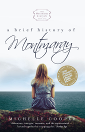
I read and loved the YA novel A Brief History of Montmaray and a main motivation in buying the book was it’s lovely cover that captured something of a love of reading and the solitariness and yearning for freedom of teenagehood. Imagine my horror when I saw the sequel in my local bookshop – The FitzOsbornes in Exile. Okay I haven’t read this sequel yet but the cover looks like something for a non-fiction book. The post next to the girl looks like some sort of farm implement and her hunched-over pose suggests she’s exhausted (the book description says “Sophie’s dreams of making her debut in shimmering ballgowns …” hmm nothing about toiling on a farm!). The publishers have also rebadged the first book to have the same look. This effort is a bit better. At least it has our heroine looking out over the sea but it’s still not a patch on the original cover.
The same thing has happened to The Prophecy of the Sisters by Michelle Zinks. The first cover was evocative and caught my eye and luckily the tale was as spooky as the cover. Now they have rebadged this book to be in keeping with the sequel Guardian of the Gate. These later covers are just ghastly. I refuse to read anything with a cover like that which is a pity because I’d really like to read the sequel. I’m sure the publishers are attempting to position these books in the vampire/zombie/horror teen fiction market when Zinks’ books are much better than that and have cross-over potential.


