Review – Of Bees and Mist

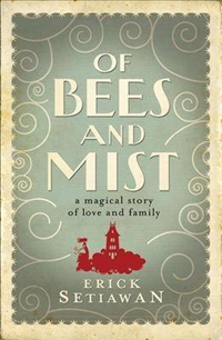
This is a truly strange book – compulsively readable and annoying in equal measure. The cover is a bit of a giveaway consisting as it does of the title in big art deco letters on a grey background with a few white curlicues ie we’ve got no idea how to classify this. Just above the author’s name is a small picturebook-like silhouette of a tower on a cloud with a windswept woman’s figure. The publisher is tentatively suggesting this might be a kid’s fantasy.

This could be a fantasy book except it is set in a picturebook ‘real world’, in a city that might be northern European, central European or Asian; it has elements of each. It could be in medieval times, the nineteenth century or contemporary times. The clothes don’t help. In one place the heroine, Meridia, wears a knee length dress, yet her father wears a top hat and cloak. Everyone walks – there are no horses, or cars, or trains. In the gardens there are roses and marigolds but also bougainvillea, the food is cakes and sandwiches but also ginger and garlic and noodles. If we accept this hybrid world it is only one step further to accept that there are yellow and blue mists that enfold Meridia’s father when he leaves the house, that the house is perpetually freezing no matter the heat outside, and that Meridia’s mother-in-law dominates her family with vicious attacking bees that aren’t visible to others.

In Meridia’s world there are fortune tellers, invisible friends and people who fade into their spirit beings but there’s also school, romance and marriage, housekeeping and starting up a business. This mishmash of elements would be fatally off putting if it wasn’t for the strong narrative drive and the barrage of mysteries to be resolved. Meridia’s mother-in-law is a truly horrendous character, such a narcissistic sociopath that she doesn’t really need the (supernatural) bees the author bestows on her to perpetuate her horrors. Be warned, her comeuppance is a long-time coming.

The novel has been called magic realism, but it doesn’t quite fit that description, also an adult fairytale. That tag doesn’t really fit either but is closer to the mark. There are sexual references and crudity of language that mark this out as ‘adult’ whereas the story itself could be young adult, or teen. Perhaps as the phenomenon of Harry Potter showed, adults do want to read young fantasy books, and Of Bees and Mist has tapped into this. Interestingly, however, they’ve marketed the novel as general fiction, not fantasy.

I found it unsettling: I thought Meridia a little too self-satisfied, her husband a dolt, the feud between Meridia’s parents unbelievable and the fate of many characters unfair but, bloody hell, I couldn’t stop reading until I’d bolted through to the end.

APA book design winners

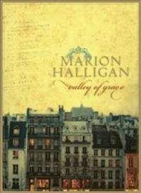
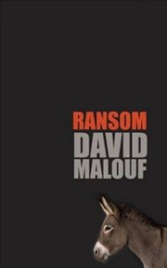
Best designed literary fiction book was Valley of Grace (by Marion Halligan) and best designed fiction cover was Ransom by David Malouf. See previous post under ‘book covers’ category for the shortlist.

Troubles is ‘lost’ Booker

The so-called ‘lost’ Booker prize (for 1970 when there was no prize awarded because of a change in the rules) has been won by J.G. Farrell for Troubles. Other contenders were Nina Bawden (The Birds on the Trees), Mary Renault (Fire From Heaven), Muriel Spark (The Driver’s Seat), and the ‘Aussies’: Patrick White (The Vivisector) and Shirley Hazzard (The Bay of Noon).

The prize was determined by popular vote on the Man Booker website from a shortlist chosen by three Gen X’ers born in 1970.

I find White and Hazard pretty unreadable but that doesn’t mean they shouldn’t have won. Peter Craven in the Sydney Morning Herald assessed the six novels and said there was “no finer piece of fiction on the list” than Spark’s The Driver’s Seat although Hazard’s novel, he wrote, “deserves a high place on [the] list”. He also rated Troubles highly – “a masterful novel that very slowly gathers momentum”. But he gave his vote to White’s The Vivisector, “a rich, all-encompassing novel full of passion, colour and the music of memory” which he read “some hot Christmas Day, a world ago, when I was young. How could I not give it my vote?” Indeed. Read Craven’s full piece here.

Australian ebooks finally?

Borders says that 2 million titles will be available through its new ebook store. They also released a new e-reader, the Kobo, undercutting the Kindle in price. As anyone who has a Kindle knows, the number of Australian titles (and you can add to this new release UK fiction) are few and far between. With the huge number of titles Borders is offering for purchase though its website in the epub format this will hopefully mean a greater range of new release Australian books available.

The Red Group (which owns Borders and Angus and Robertson) says that more than 100 local publishers, including Allen and Unwin, Pan Macmillan, and HarperCollins, have signed up. The Australian Bookseller and Publisher website reports that Scribe’s initial batch of ebooks will be available on the Borders site within the week and Text says titles by Kate Grenville, Helen Garner and Shane Maloney will also be available soon. Spinifex Press and MUP are said to have signed and Simon & Schuster would make selected Australian titles available.

Summertime and The World Beneath win

The NSW Premier’s Literary Awards were announced yesterday and J M Coetzee won the Christina Stead Prize for Fiction for Summertime, Cate Kennedy the People’s Choice Award (I voted!) for The World Beneath and the UTS Glenda Adams Award for New Writing for Fiction went to Andrew Croome for Document Z.

I’m happy to see Coetzee and Cate Kennedy up there, although the extent to which Coetzee’s fictionalised memoir is really a great novel is perhaps debatable. I base this judgement on Youth, the predecessor to Summertime, which I have read and enjoyed as a self-excoriating account of university days, first jobs and first excruciating sexual relationships – but a novel, fiction? In true form Coetzee didn’t turn up to collect the award in person.

I thought Andrew Croome’s Document Z a strange choice for best new writing. He probably got top marks for choosing a subject – politics and espionage – that is unusual for a first novel in this country. Document Z is about the Petrov Affair, and is mainly set in Canberra in the fifties. Croome’s book is closer to the genre end than the literary and was up against Steven Amsterdam’s Things We Didn’t See Coming and Karen Hitchcock’s very well reviewed Little White Slips, amongst others.

National pride covered

An article in the UK Guardian newspaper (reprinted from the Observer) by Tom Lamont looks at why books published in different countries have different covers. Any search through Amazon comparing the versions on offer to the Australian book will illustrate this phenomenon. Call me nationalist but I usually like the Australian versions, especially when compared to the US.

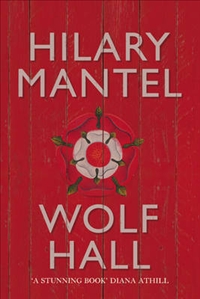
The Observer article quotes Julian Humphries, head cover designer at Fourth Estate, as saying, “Different sales channels have different sensibilities. It’s a cultural thing as taste-driven as different countries eating different things for breakfast”. Lamont goes on to say that literary fiction is easier to sell in mainland Europe than in the UK or the US, so publishers in Europe can be “less overt in their attempts to grab the attention of customers.” Hence covers with simple images and plain type. Nathan Burton, a UK designer, says, “The UK book market is more competitive, all the covers in shops shouting: ‘Buy me!’ We have to put on a bit of extra spin.” The US, they say, “signposts its literary fiction more than the UK” and the article compares the covers of Wolf Hall in the UK and US. The US one is more historical and apparently has won awards. Burton says he doesn’t like to look at other cover versions of a book when working on a cover – “It’s always best to work from fresh”. Lamont wonders whether the need for differences between countries really amounts to little more than national pride. Or more likely local publishers insisting that they know their own market better than their OS HQs do. See the original article here.

Clockwise from top left Wolf Hall Canadian edition, UK and Australian paperback, UK hard cover/Australian trade paperback and US version.

Dying different ways

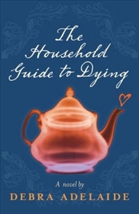
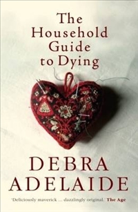
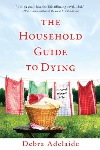
The covers for Debra Adelaide’s (Australian) novel The Household Guide to Dying for different editions shows a variety of approaches and the difficulty in marketing a book that is, at once, about dying, a spoof on self-help “guides”, an exploration of the value of relationships and of loss, and about the joys of domesticity. Of all the covers I like the UK edition (left) best, it’s colouful, arty and suitably mysterious. The first Australian cover was mysterious, but in an irritating way. There’s that sombe grey/blue and a see-through teapot with a steam heart coming out of it (below left). The second Australian edition is a little better, capturing the domestic angle, and the design is neat and attractive (below right). I have no idea what the Americans were thinking with the hardcover edition there: it is very severe and has a non-fiction look about it (bottom left). As if to compensate for this they’ve gone too far in the opposite direction with the paperback version – a dinky, jaunty, twee, Maeve Binchy look suggesting the book is much, much more lightweight than it is. The novel might have an ironic voice but it has a serious intent.

Heads and legs

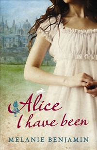
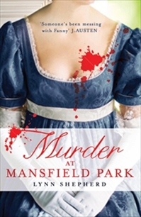
Headless in history (see also “Females sans heads” under “book covers” category)

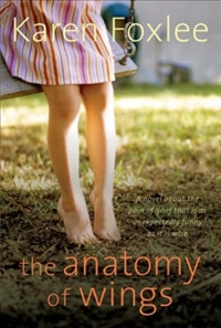
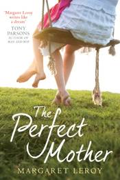
A coincidence? These covers look very similar:

Short stuff

Melbourne stand-up comic and Age columnist Catherine Deveny was sacked from her newspaper for inappropriate Tweeting during the Logies ceremony. I remember when email first arrived and everyone was shooting off emails impulsively and then feeling chagrined at the things said. Now we’ve developed an appropriate language for emails and make sure we check them for “tone” before sending. I wonder if Tweeting doesn’t have this yet, or whether it’s built into the form not have it. And is it also part of the reduction of wordage to fit into modern (fast) life? Is that why short story contests now specify a word length of 1,500 words, or even shorter, the so-called short, short stories of 700-800 words. The ABC’s Radio National has asked for “celebratory, thoughtful, descriptive, creative works that engage with the human/avian relationship” for its Birdland project. The word length – 300. Don’t we already have a creative short form that often runs to that length, and isn’t it poetry?