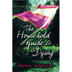
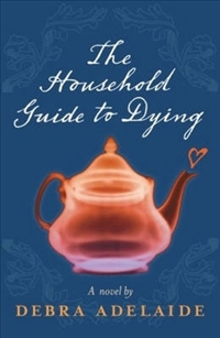
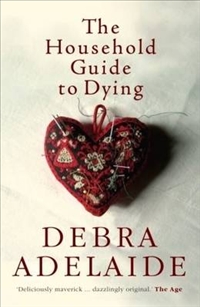
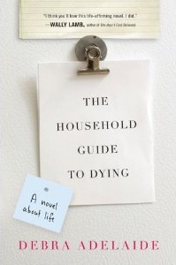
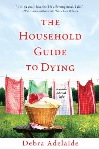
 The covers for Debra Adelaide’s (Australian) novel The Household Guide to Dying for different editions shows a variety of approaches and the difficulty in marketing a book that is, at once, about dying, a spoof on self-help “guides”, an exploration of the value of relationships and of loss, and about the joys of domesticity. Of all the covers I like the UK edition (left) best, it’s colouful, arty and suitably mysterious. The first Australian cover was mysterious, but in an irritating way. There’s that sombe grey/blue and a see-through teapot with a steam heart coming out of it (below left). The second Australian edition is a little better, capturing the domestic angle, and the design is neat and attractive (below right). I have no idea what the Americans were thinking with the hardcover edition there: it is very severe and has a non-fiction look about it (bottom left). As if to compensate for this they’ve gone too far in the opposite direction with the paperback version – a dinky, jaunty, twee, Maeve Binchy look suggesting the book is much, much more lightweight than it is. The novel might have an ironic voice but it has a serious intent.
 |
 |
 |
 |

